
The original logo is on the left. One of the finalized concept logos is on the right.


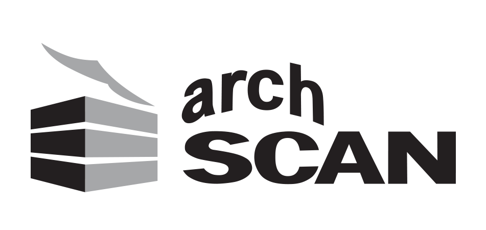
The first is the original archSCAN logo with distorted red 'arch.' Two versions of the finalized logo follow. We had to compromise on rebranding the entire logo as there was a lot of resistance. The square version is optimized for social media avatars.
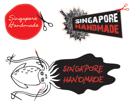
These were some concept ideas for Singapore Handmade. The first concept is a reference to the city being referred to as 'the little red dot.' The halftone graphic is of a durian, the famous stinky fruit. The last one is of a squid or sotong in a puddle of black ink.
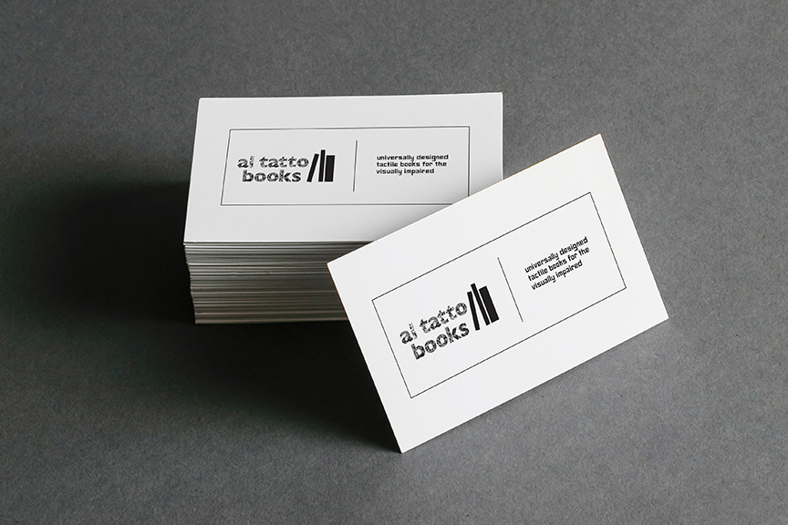

al tatto means "to the touch" in Italian. This moniker is for a line of tactile books that are marketed for the visually impaired.
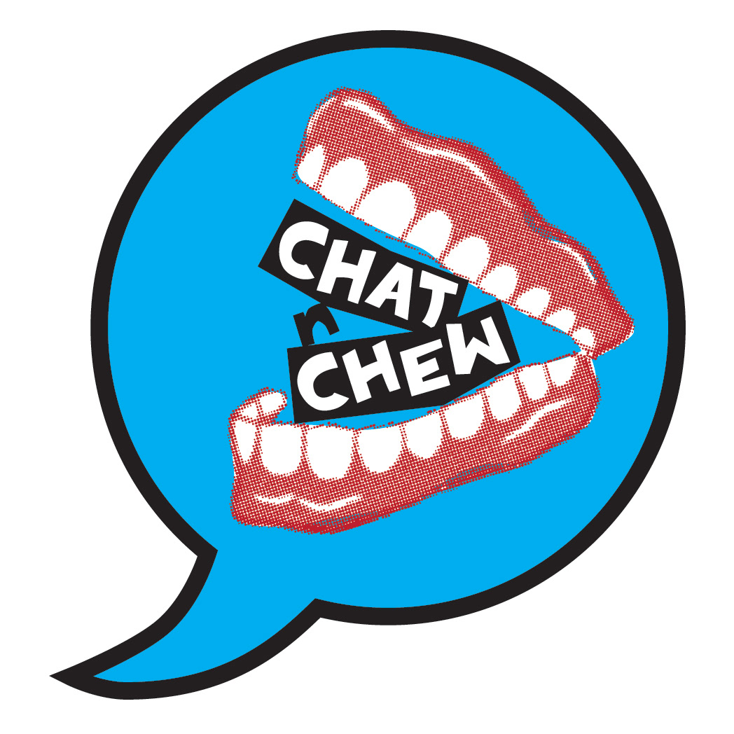
This logo was developed for a YouTube channel called Chat N Chew, Tasty Conversations About Life. The joking denture teeth will be animated in introductory videos using After Effects.
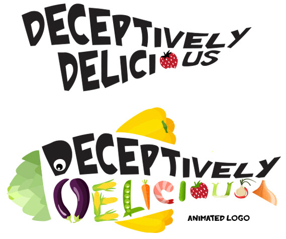
This is a work-in-progress logo for an animated kids series about adopting a healthy eating lifestyle. The tagline of Deceptively Delicious is: "The Sneaky Art of Making Nutritious Food that kids Will Love!"
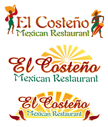
Some Mexican restaurant concept logos.
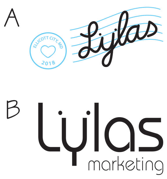
These two logo concepts were created for a marketing company run by two sisters. LYLAS stands for Love Ya Like A Sis. The blue postmark not only refers to the location of the firm but also gives a nod to lined paper for schoolwork.

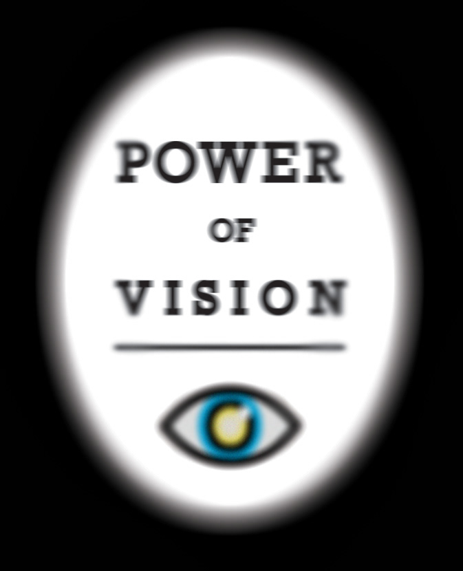
Some concepts for an eye awareness campaign in Singapore.

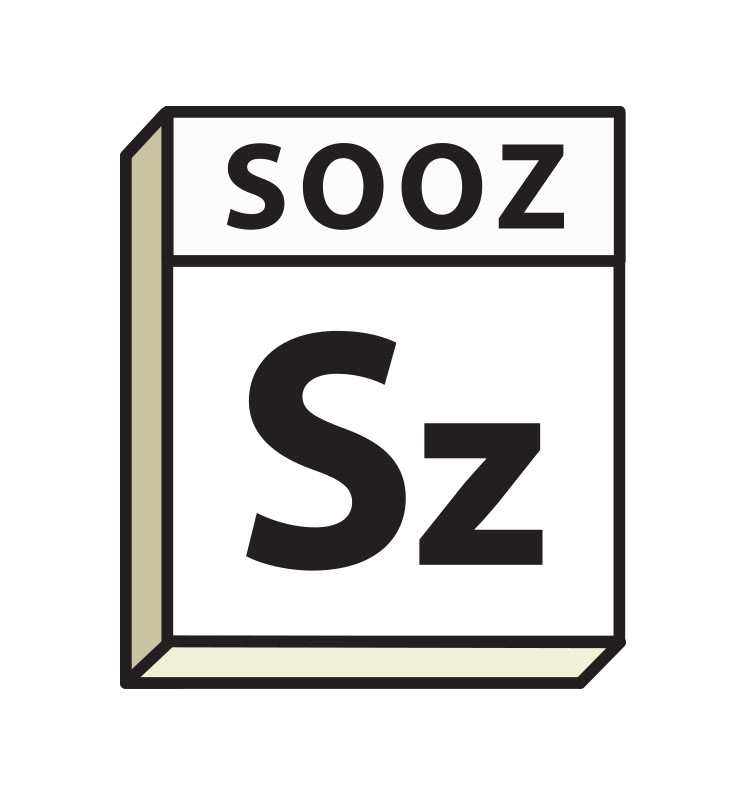
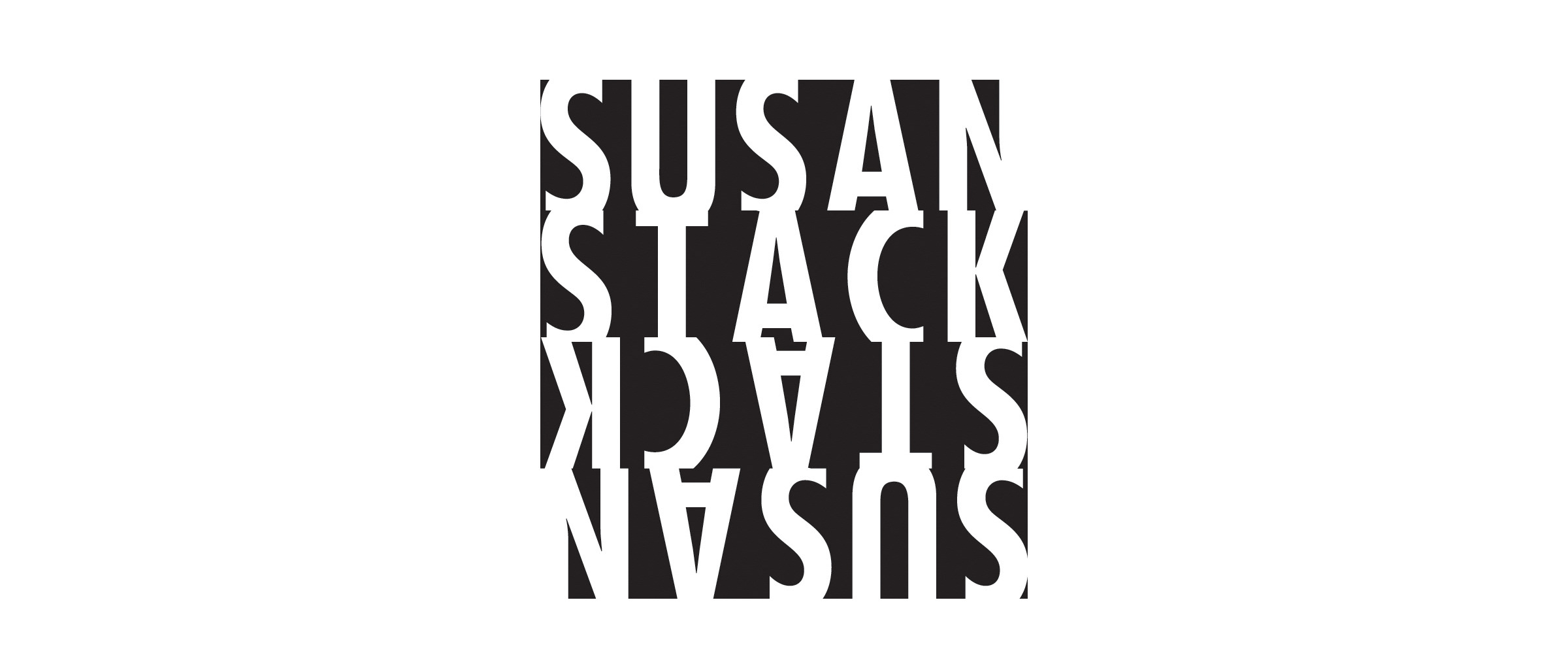
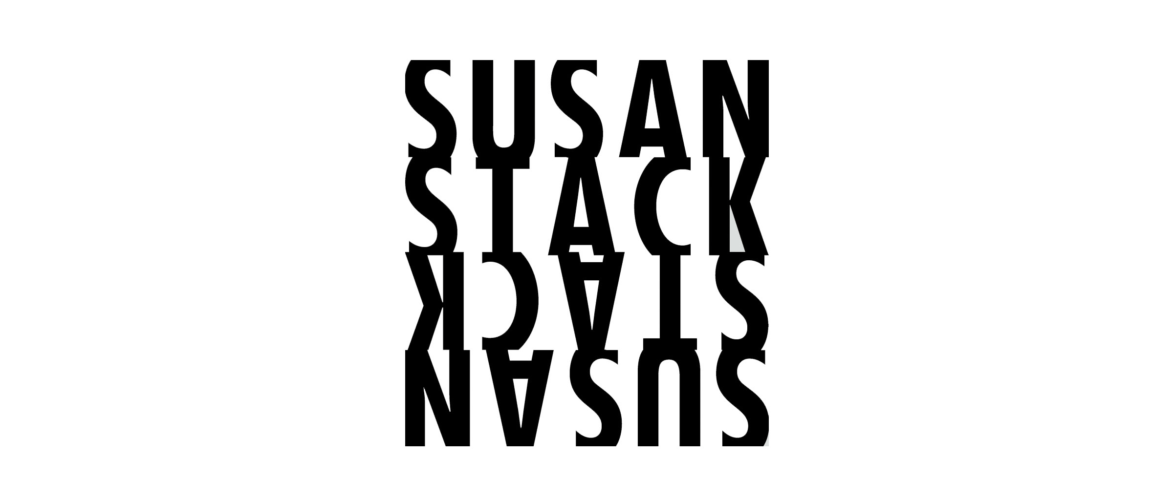
Some personal branding logos.